Sean Leffers Sails Through Deadlines for Pacifique, with Only One Broken Window to Boot
For the designer's first restaurant, in West Hollywood, installing the perfect light in time for the opening took some creative problem-solving
May 14, 2019
Sometimes the best projects are the ones you create for yourself. That’s what happened when a group of friends sat down to a boozy dinner and emerged with the plans for a new restaurant in the heart of the West Hollywood Design District: Pacifique. “It was really exciting for me because I had never done a commercial property,” says interior designer Sean Leffers. “Designing a home can be a really emotional experience for the people who live there. This was just a lot of fun—and hard work, but mostly fun.” The result is a sleek space where Japanese minimalism and French classicism come together in surprisingly chic ways. Here’s the story behind the design.
AD PRO: This was your first commercial space. How did it go?
Sean Leffers: I got my first gray hair from this project; it was a little crazy. We had five months to get it all done, which seems like a lot, but some of the lead times to order from vendors were that long. Things were arriving the week we opened. But it was also really fun. It was definitely a check on me because I’m obsessed with fabric. I probably have a thousand fabrics in my studio just waiting to be used. There were times when they had to say, “Absolutely not, you’re not putting that 5,000 double-rub fabric in here.” But otherwise I had complete creative control, which was great.
AD PRO: Because this was a commercial project, were there codes or ordinances that you had to learn on the fly?
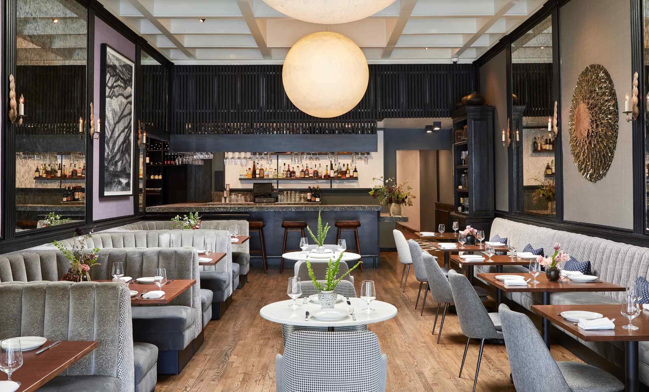
SL: You have no idea. The bar in the back of the restaurant is stone that comes from only one quarry in Brazil. Even the health and safety inspectors weren’t familiar with it. They were saying that we couldn’t use it. This was after it was already installed! So I had to research it. Most of what I found was in Portuguese, so I had to have a friend translate it, and then write a mini essay on the density and nonporousness of the stone to the city of Los Angeles to get it approved. But it was totally worth it. When people sit at the counter they literally caress it. It has this spectacular feel to it, and it looks like it’s strewn with cherry blossom petals, which works really great with the shou sugi ban wood in the bar.
AD PRO: That’s an interesting cultural mash-up, but that’s the point of Los Angeles, right?
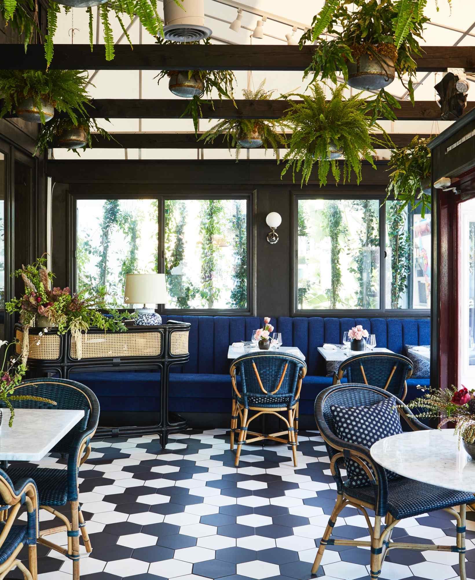
SL: Yeah, it’s really fascinating to think about how cultures have cross-pollinated over time. We tried to approach the space through the mind-set of a woman who lived in Tokyo in the 1920s and was probably being exposed to more of a Western influence. The scalloped sconces are halfway between Provence and Japan. The sea is something that connects both cultures, and the front patio is inspired by classically French cafés, but the Ann Sacks tile in that sakura blossom arrangement brings it back to the Japanese aesthetic. Cultural mixes are California. It’s exciting to live in a place that’s constantly evolving and to create a space where all of these different identities are coming together.


